Walk into a bathroom with cool gray walls and a bright white tub, and it can feel a little like a dentist’s waiting room. That look had a long and loyal run, but it’s wearing thin. So, what is the in-colour for bathrooms in 2026? There isn’t one single shade. The year belongs to a warm, softened palette of sage and olive greens, creamy neutrals, and a handful of moody darks.
Quick answer: In 2026, homeowners and designers are swapping sterile white and cold gray for calm, spa-like colors with some warmth in them. Think soft sage and olive, creamy shades from bone to sand to mushroom, and deep, intimate tones such as espresso, charcoal, burgundy, or a green so dark it nearly reads black. Lighter, warmer colors keep small or dim rooms feeling open, while the dark ones belong in powder rooms and baths with good lighting.
This guide from San Diego Home Remodeling explains each direction in plain terms, shows you how to match it to a bathroom in our coastal light, and flags the mistakes that quietly ruin a paint job. Whether you’re hunting for bathroom paint colors for a quick weekend refresh or planning a full remodel, you’ll finish with a short list you can actually test.
The Short Answer: What Is the In-Colour for Bathrooms in 2026?
The in-colour is more of a mood than a single swatch. Warm, hushed, nature-inspired colors are replacing the clinical look, and they fall into five groups:
- Sage, olive and deeper greens for a calm, spa-like feel
- Warm neutrals such as cream, bone, sand, mushroom, and greige
- Terracotta and clay for earthy warmth
- Deep navy and teal for contrast and depth
- Moody darks like espresso-charcoal, burgundy, and blackened green
The common thread is warmth and softness. Even the dark options lean rich and earthy instead of sharp and glossy. If you’re collecting bathroom color ideas, treat these five as lanes rather than rules. Pick the lane that suits your light and your existing tile, then narrow down the exact shade by testing it.
Why Cool Gray and Clinical White Are Fading Out
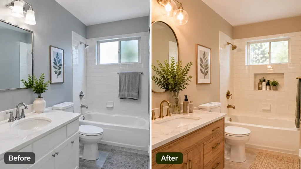
Cool gray won the last decade because it felt safe. The trouble is that under typical vanity lighting, it can drift toward blue and make a room feel flat and a little cold. Pure white has a similar problem. It looks crisp on day one and then shows every water spot, toothpaste splash, and shadow.
Meanwhile, home design has been moving toward texture: oak and walnut vanities, honed stone, woven baskets, plants, handmade-looking tile. Cool, sterile colors fight with those materials. Warm colors let them breathe. To be fair, neither gray nor white is banned. A bathroom with gray tile and chrome fixtures can look excellent. “Fading out” simply means these colors no longer feel new, and that matters if you’re repainting to refresh a space or to help a home feel current.
Warm Mushroom and Soft Greige
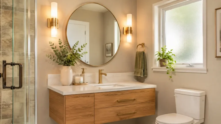
Mushroom is what you get when beige and gray have a quiet conversation. It’s a muted, warm gray-brown that feels grounded without being heavy. Greige is its slightly lighter cousin. Both are forgiving, which is why they sit near the top of many lists of the best bathroom paint colors for 2026. They shine next to natural wood vanities, honed marble and travertine, and they make brass or aged-bronze hardware look intentional.
They suit primary baths, hall baths, and any home you might sell in a few years, because they appeal to a wide range of buyers. One practical warning: warm neutrals can pull pink or yellow under warm bulbs. Before committing, hold the sample next to your tile and countertop. If the wall makes your white tile look dingy, switch to a neutral with less red in it.
Sage, Olive and Eucalyptus Green
Green is the color most people didn’t expect to love in a bathroom, and now it’s the one they keep asking about. Soft, gray-leaning sage is the easiest entry point. It reads calm, almost like a eucalyptus leaf, and it plays nicely with white tile. Olive adds more depth and a vintage feel. Deeper greens, close to forest or bottle glass, work beautifully when you drench a small alcove, a vanity wall, or the cabinet itself.
Pairings matter. Brass and warm wood make green feel rich and lived-in. Matte black hardware gives a crisper, more modern edge. Add a plant, a stone countertop, or a linen towel, and the room starts to feel like a retreat. The edge case to watch is yellow undertone. A green with too much yellow can look swampy under warm bulbs and muddy in a windowless room. Look for a touch of gray or blue in the mix, and test it at night with the lights you’ll actually use.
Deep Navy and Teal (Use Them as Accents)
Dark blues feel dramatic and tailored, but they’re easy to overdo. Here’s the approach San Diego Home Remodeling suggests: let navy or teal live on one strong element, like the vanity, a feature wall behind the tub or the shower tile, and keep the rest of the room lighter. You still get the richness without the cave effect.
Small bathrooms need extra caution. Dark color on all four walls absorbs light and can make a tight space feel smaller, which is the opposite of what most people want from small bathroom paint colors. If the room has no window, save the deep shade for a single wall or the cabinet. Powder rooms are the exception. A guest bath that people use for two minutes is a great place to go all in with espresso, charcoal, burgundy, or a near-black green. Add a good mirror and warm sconces, and the room feels intimate instead of gloomy.
Terracotta and Clay Tones
Terracotta brings sun-baked warmth, and it suits San Diego surprisingly well. It echoes Spanish-style architecture, clay roof tile, and mid-century ranch homes with earthy palettes. Lighter clay shades work on walls. Deeper, redder terracotta is usually better on tile, a niche, or a single accent so the room doesn’t feel like a sunset.
Finish matters here. Matte or velvety finishes soak up light and make the color feel soft and natural, while glossy finishes can make it look sharp and artificial. Warm bulbs make terracotta glow, but cool bulbs can turn it brown and dull. Pair it with cream, wood, black metal, or sage green, and you’ll have one of the more distinctive bathroom color ideas of the year without going over the top.
Soft Warm Whites Are Not Dead
Here’s the reassuring part: you don’t have to abandon white. What’s changed is the undertone. Creamy, soft off-whites with a touch of warmth are replacing the starkest bright whites. They’re ideal for windowless or very small bathrooms where you need to bounce around every bit of light.
Warm whites also make great partners for bolder choices. Use one on the ceiling and trim of a deep green or navy bathroom, and the dark color will look deliberate rather than heavy. Just make sure the white matches your fixed elements. A cream wall next to a stark white tub can make the tub look like it needs a scrub.
How to Choose the Right Color for a San Diego Bathroom
Trends are fun, but your bathroom has its own conditions. Start with three questions. How big is the room? What kind of light and fixtures does it have? And what feeling do you want: calm spa, warm and earthy, or bold and moody? Those answers decide more than any list can. So, what is the in-colour for bathrooms in 2026 for your house? It’s the trend color that behaves well in your light and with your tile.
Lighting and Window Direction
San Diego light has its own personality. Along the coast, the marine layer can leave mornings gray and soft for weeks, which can make cool colors look flat and sleepy. Warmer shades usually counter that. Inland, bright sun can wash out pale colors and make saturated ones look louder than the swatch. A south-facing window gives strong, warm light, while a north-facing one is cooler and steadier.
Windowless bathrooms depend entirely on the bulbs, so check the bulb temperature before you pick a color. Whatever the room, test properly. Paint a large sample board or use peel-and-stick samples, place them on two different walls, and look at them in the morning, at midday, and in the evening.
Tile, Vanity and Hardware Pairing
Begin with what isn’t changing: tile, tub, countertop, and flooring. The wall color has to agree with their undertones. Warm brass and wood vanities love creamy neutrals and greens. Chrome and brushed nickel stay cooler and look better with blue-leaning colors. Matte black works almost anywhere, which is why it’s so popular. Take a photo of the sample next to all of these pieces together rather than judging the color alone.
Finishes and Fixtures That Make the Color Work
The color is only half the job. The finish decides how it looks in two years. Bathrooms are damp, so choose a paint made for bathrooms or one labeled mildew-resistant, and prime bare or patched drywall first. A satin or similar low-sheen finish is a common choice because it’s easy to wipe and doesn’t show every wall flaw. Full gloss on dark colors tends to highlight roller marks and uneven patches. Ventilation matters more than most people admit. Even great paint struggles if steam hangs around, so make sure the exhaust fan actually works and keep it running after showers.
Grout is the sleeper detail. Warm grout softens warm walls, while stark white grout lines can look busy against creamy tile. Hardware finishes should finish the story rather than compete with it. If you’re replacing the tile, vanity, or layout at the same time, a Bathroom Remodeling in San Diego project lets you choose everything as one coordinated set instead of matching new paint to old pieces.
Color Mistakes to Avoid
Most paint regrets come from the same few moves:
- Choosing from photos alone. Screens shift color, and photos are edited. Even the best bathroom paint colors can look wrong in your light.
- Skipping samples. A swatch the size of a coaster tells you almost nothing. Test big, and test at night too.
- Going dark in a tiny, windowless room. That’s the quickest way to make small bathroom paint colors feel like a closet. Use the dark shade on one element instead.
- Pairing glossy finishes with deep colors. The shine exaggerates every imperfection.
- Matching trendy paint to permanent surfaces. Paint is easy to change later. Tile and a custom vanity are not.
- Ignoring undertones. Two beiges can look completely different next to the same white tile.
Does Color Choice Affect Resale and Cost?
Paint is the cheapest and most reversible design decision in the bathroom. Tile, a vanity, and countertops are the opposite: expensive to change and long-lasting. That’s why a smart strategy is to keep permanent items in timeless neutrals, then let the trending colors live in paint, towels, mirror frames, art, and a few accessories. Buyers usually respond better to calm, warm, well-kept spaces than to a bold experiment they have to undo.
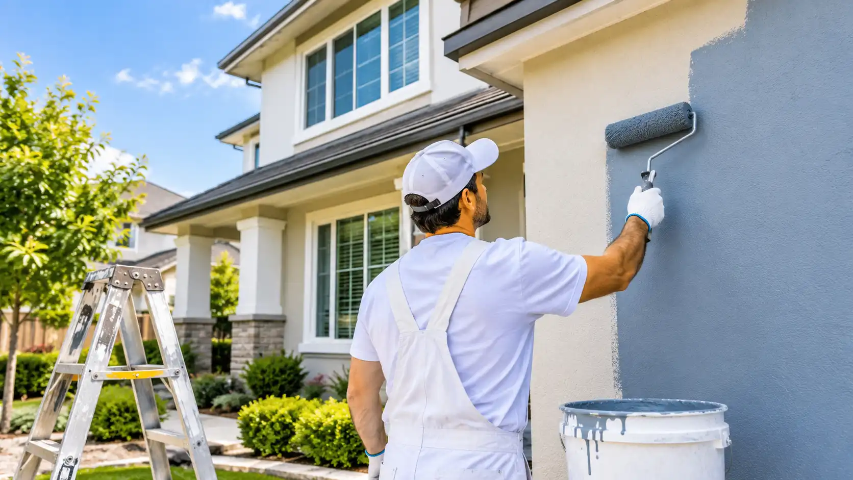
A trend color can still help a home feel current, but it works best when it supports the room instead of defining it. There’s no magic return on any one shade, so choose what you’ll enjoy living with. When you want to try new bathroom paint colors without giving up a weekend to taping and cutting in, handing the job to a team that offers San Diego House Painting Services is the low-commitment route, and you can always repaint later.
Final Thoughts
So, what is the in-colour for bathrooms in 2026? Warm, calm and earthy: sage and olive greens, mushroom and sand neutrals, soft whites, terracotta, and deep blues or moody darks used with intention. Match the shade to your light, your tile, and your room size, test it for a full day, and keep the permanent pieces neutral.
If you’d like a second opinion on bathroom paint colors, or you want to talk through a repaint or a full remodel, contact us. San Diego Home Remodeling is happy to help you turn your favorite bathroom color ideas into a room that looks good in every kind of light.
Frequently Asked Questions
What is the most popular bathroom color in 2026?
Warm, earthy shades lead the way: sage green, mushroom and sand neutrals, and deep blues. If you want the safest pick among the best bathroom paint colors this year, start with a creamy warm neutral and add a green or blue accent.
Is gray still in style for bathrooms?
Gray isn’t banned, but cool, blue-leaning gray feels dated. A warmer greige or a gray-green is a better fit, unless your tile and fixtures are already gray and you want everything to match.
What color makes a small bathroom look bigger?
Light, warm neutrals and soft greens are the most reliable small bathroom paint colors. Keeping the walls, ceiling, and trim close in tone also helps the room feel less chopped up.
Is green a good color for a bathroom?
Yes. Sage and olive pair well with brass, wood, and natural stone, and they create a calm, spa-like feel. Just test the sample under your own bulbs, because greens with a lot of yellow can look muddy.
Should I pick trendy colors for tile or only for paint?
Keep tile, vanity, and countertops in lasting neutrals, and use paint and accessories for the trend. Paint is simple to change when the trend moves on, but tile isn’t.